


-

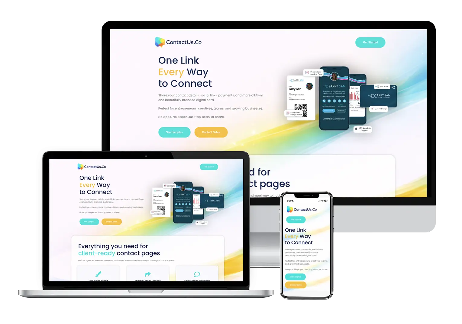
- Responsive web design showing the ContactUs.Co digital contact card platform across desktop, tablet, and mobile devices.
-
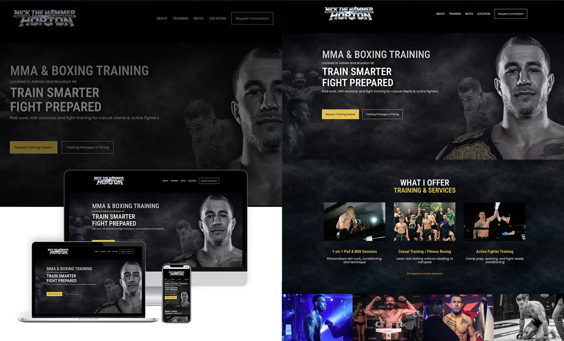
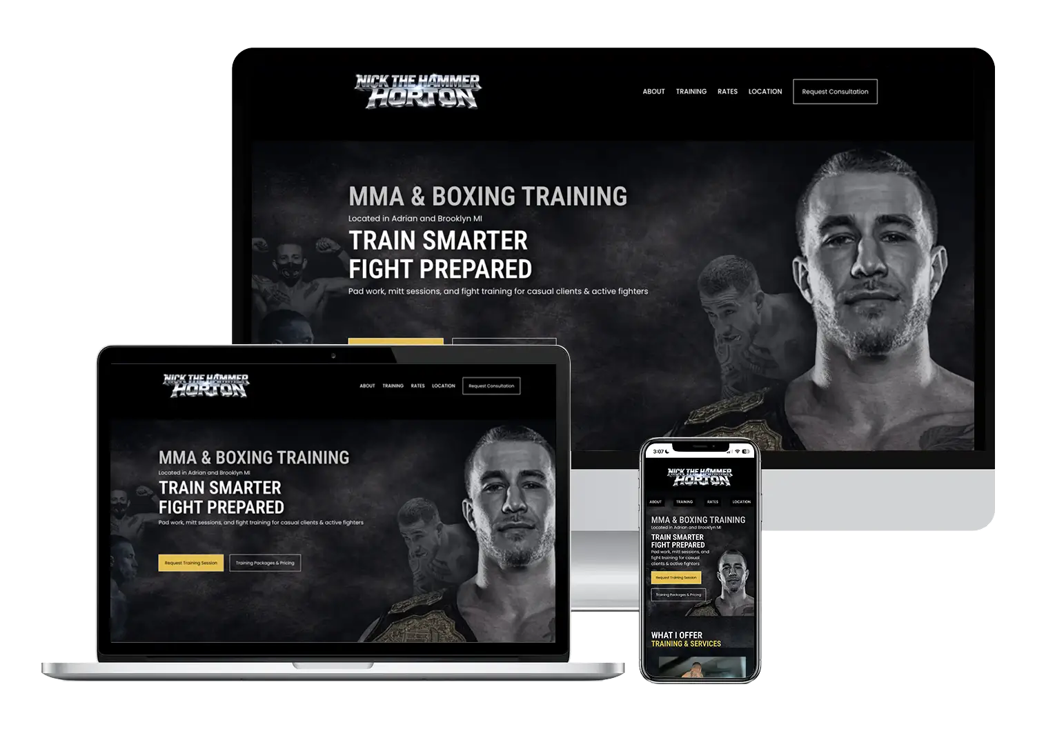
- Custom MMA and boxing training website designed for professional fighter Nick “The Hammer” Horton.
-
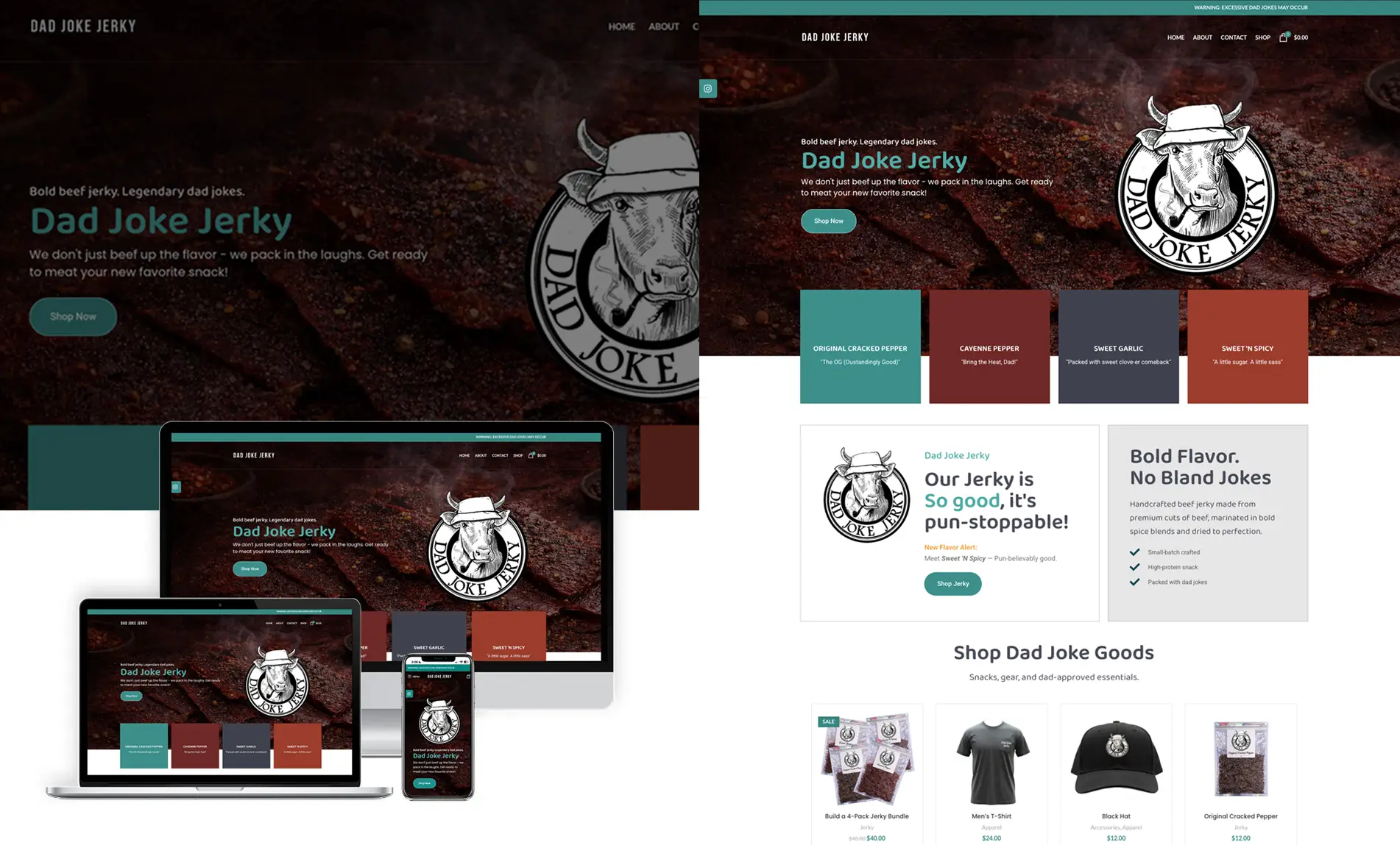
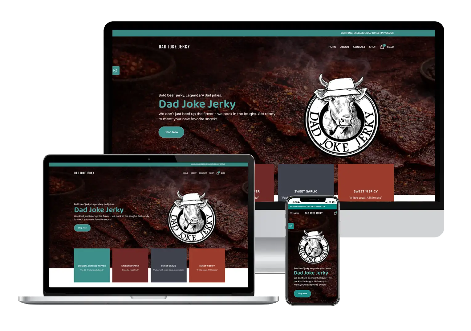
- WooCommerce ecommerce website designed for Dad Joke Jerky, a California beef jerky brand.
-

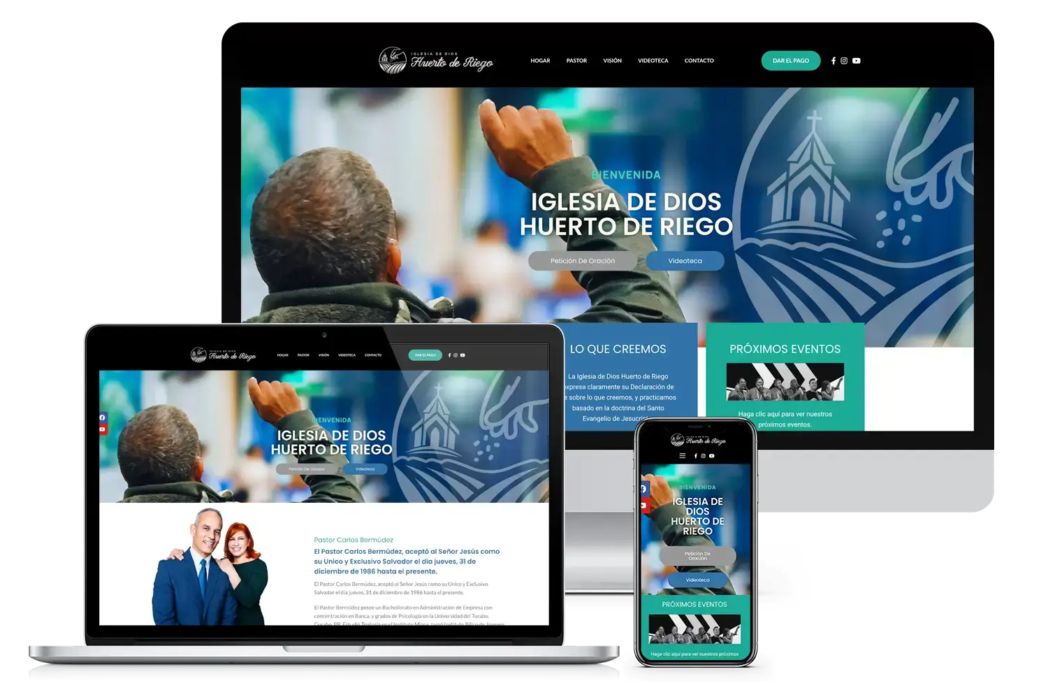
- Spanish church website design for Iglesia de Dios Huerto de Riego.
-
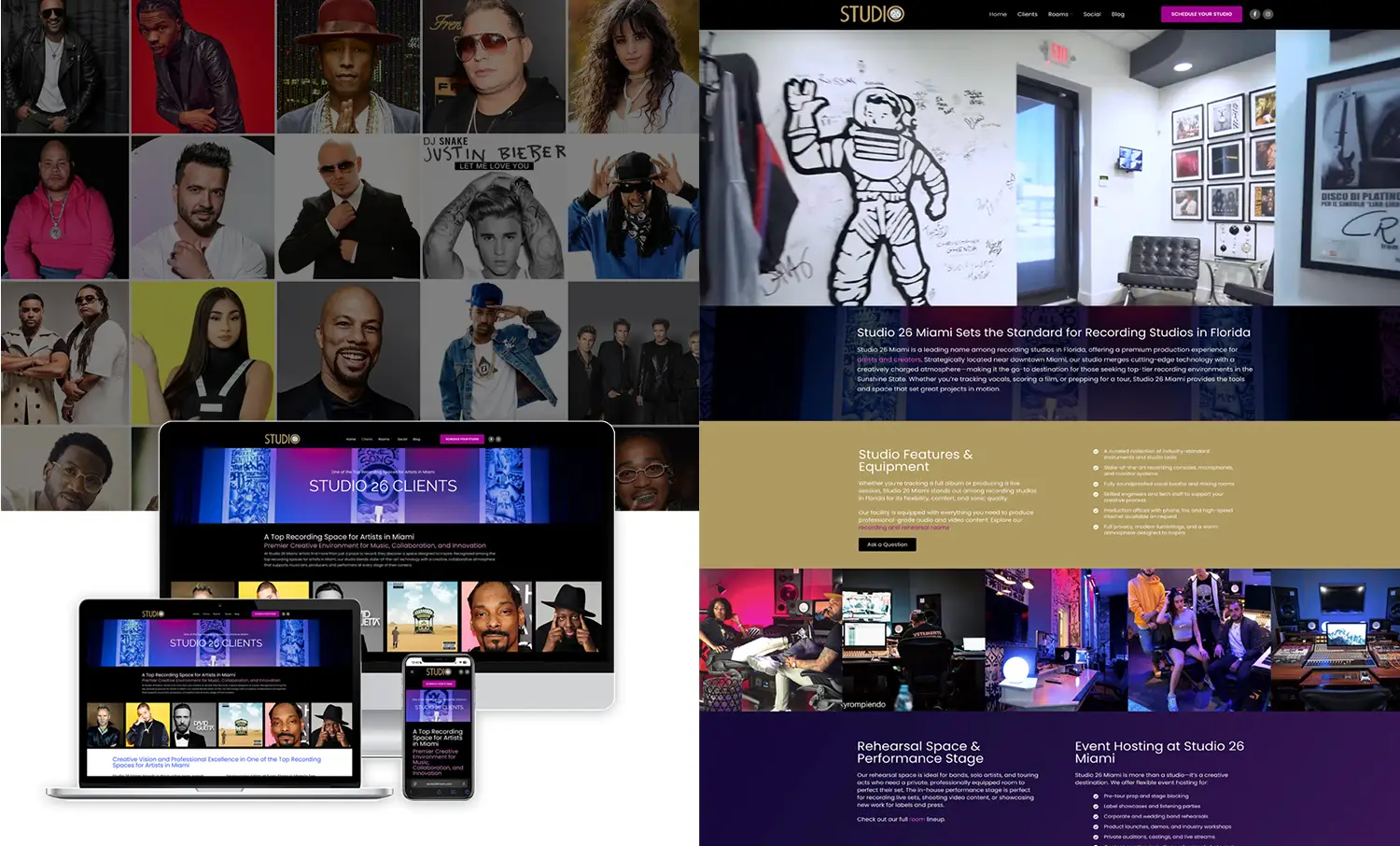
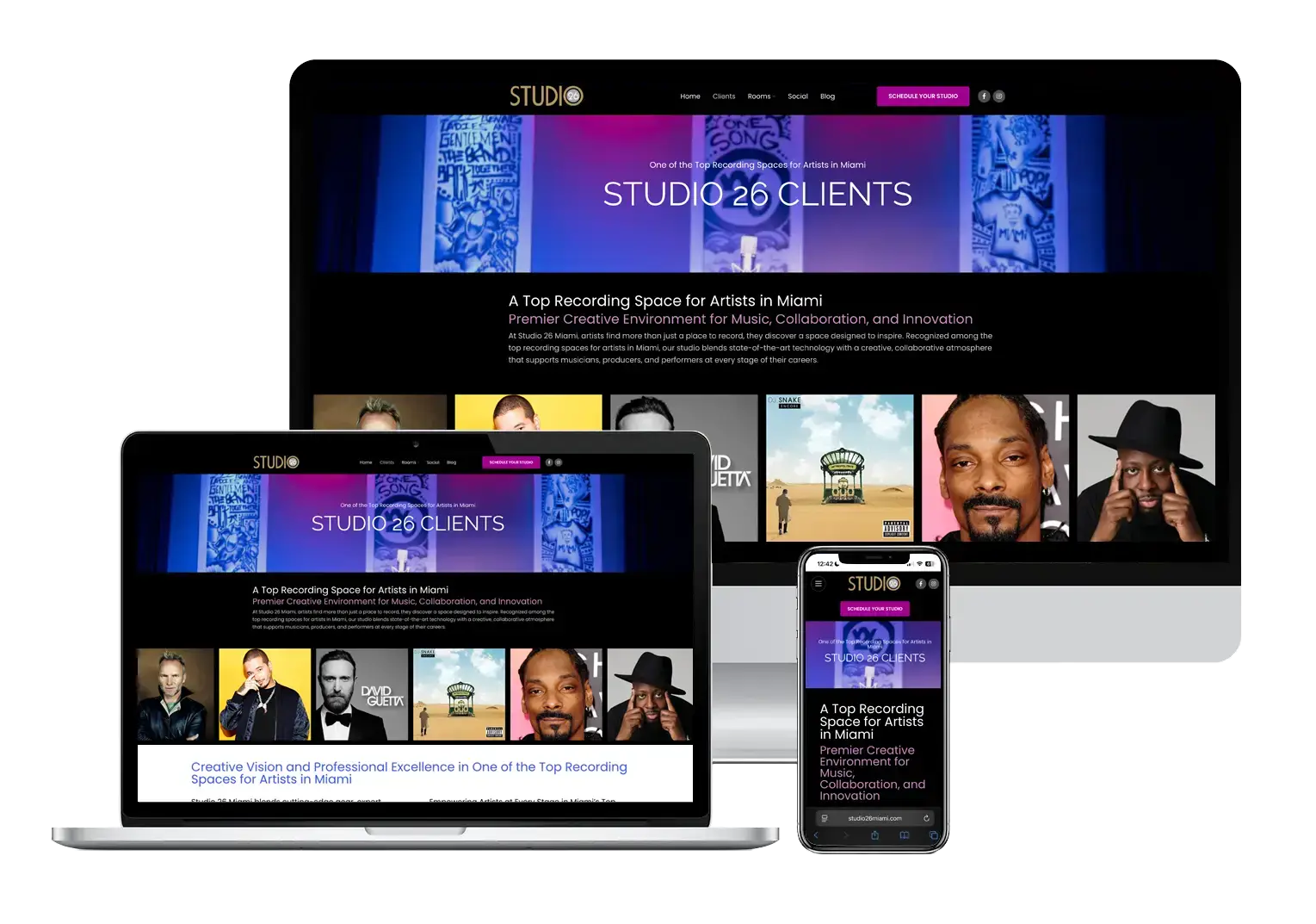
- Studio 26 Miami’s website redesigned with stronger visuals, better UX, and improved SEO to increase visibility for artists and bookings.
-

- Bold, modern logo design that defines your brand
-
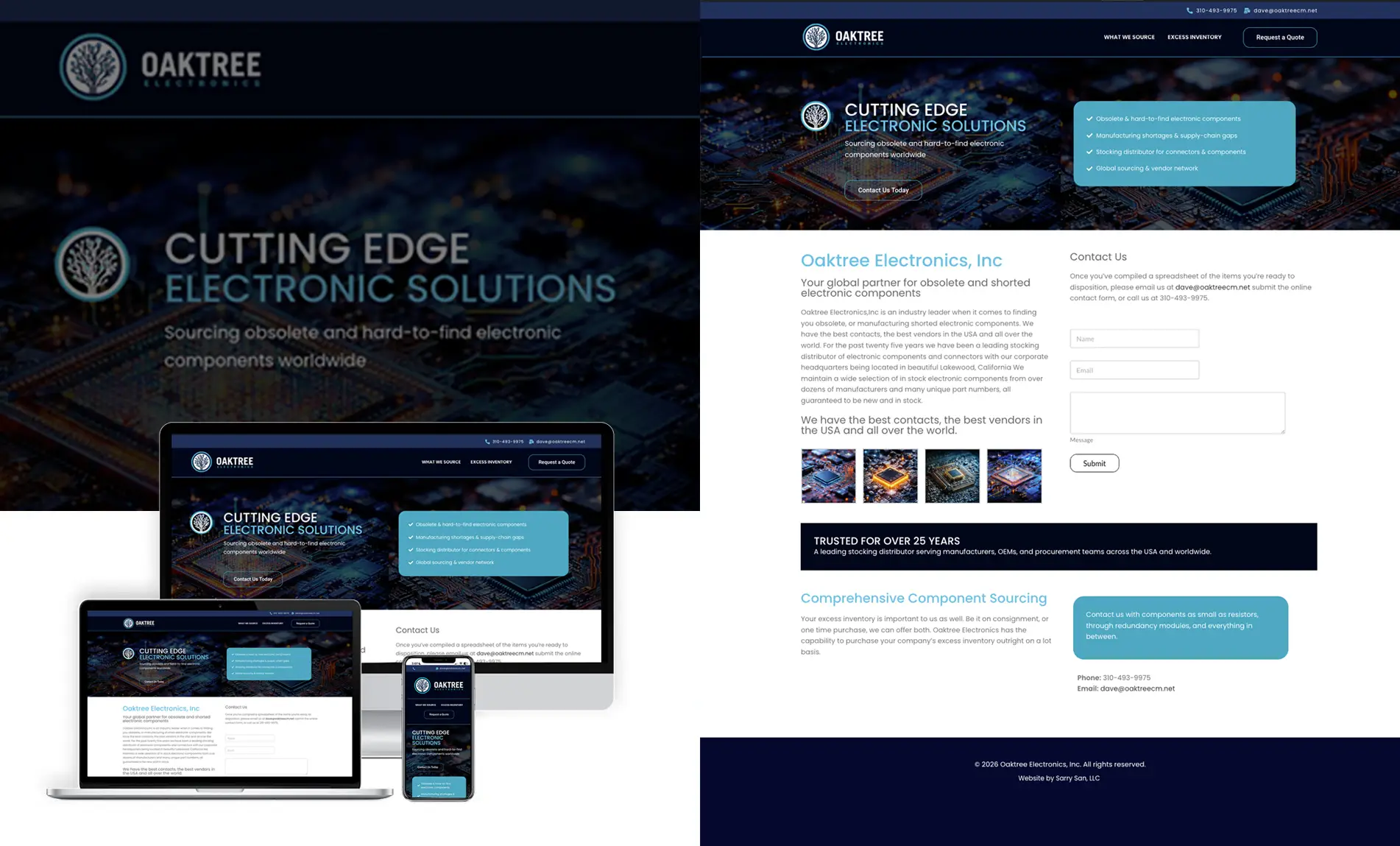
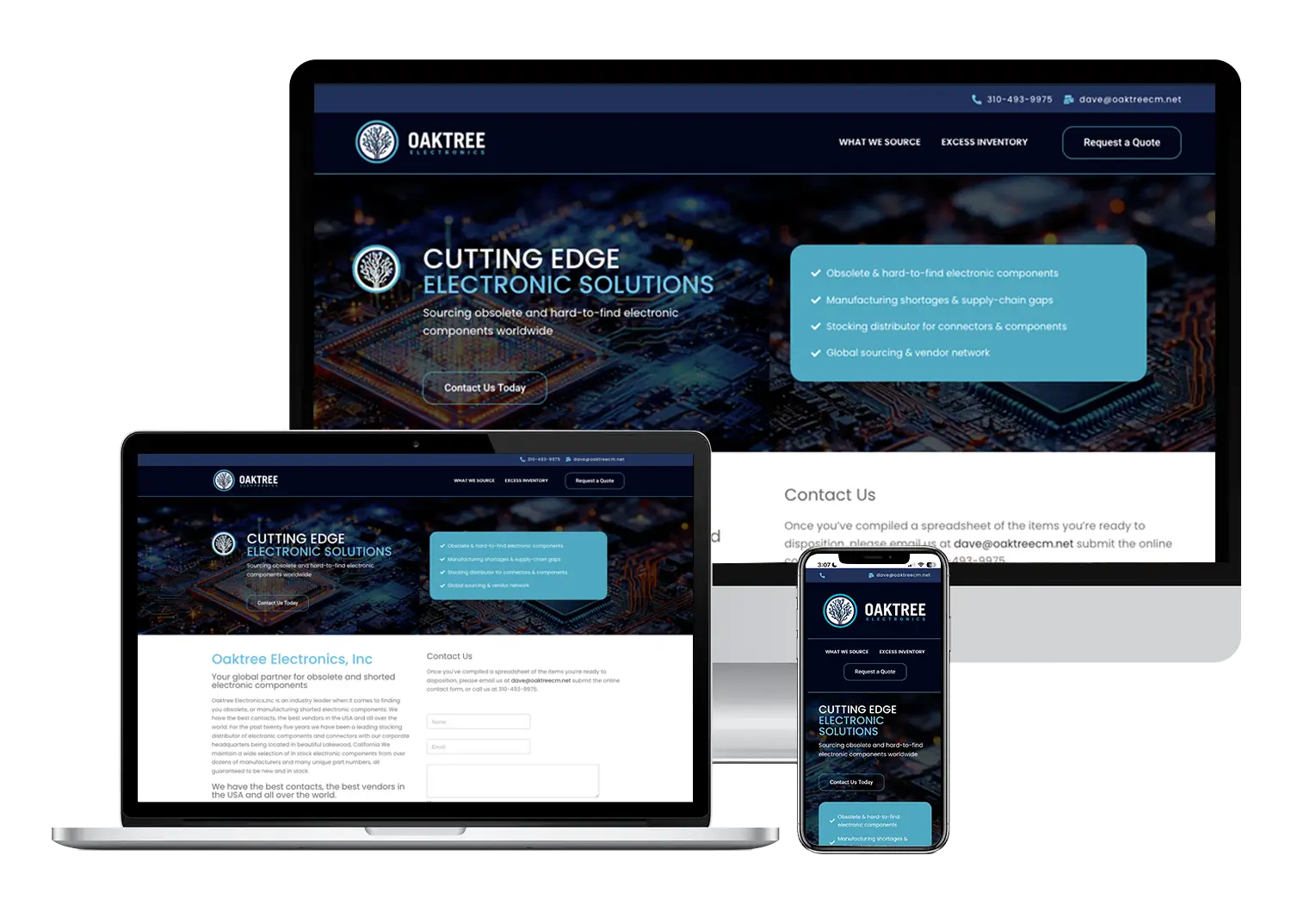
- Corporate website designed for Oaktree Electronics, a global electronic components sourcing company.
-
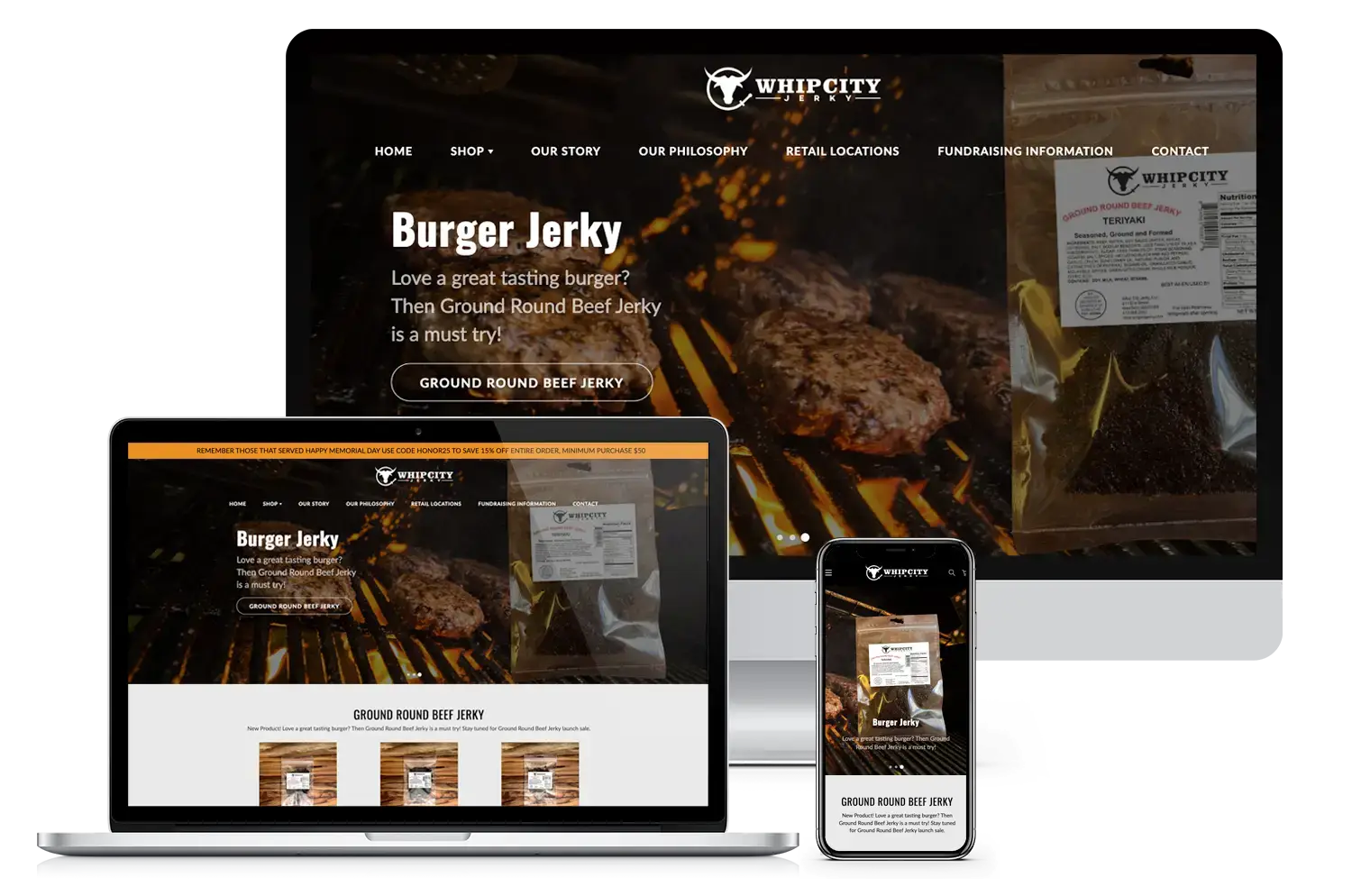
- Shopify eCommerce redesign for Whip City Jerky’s online storefront.
-
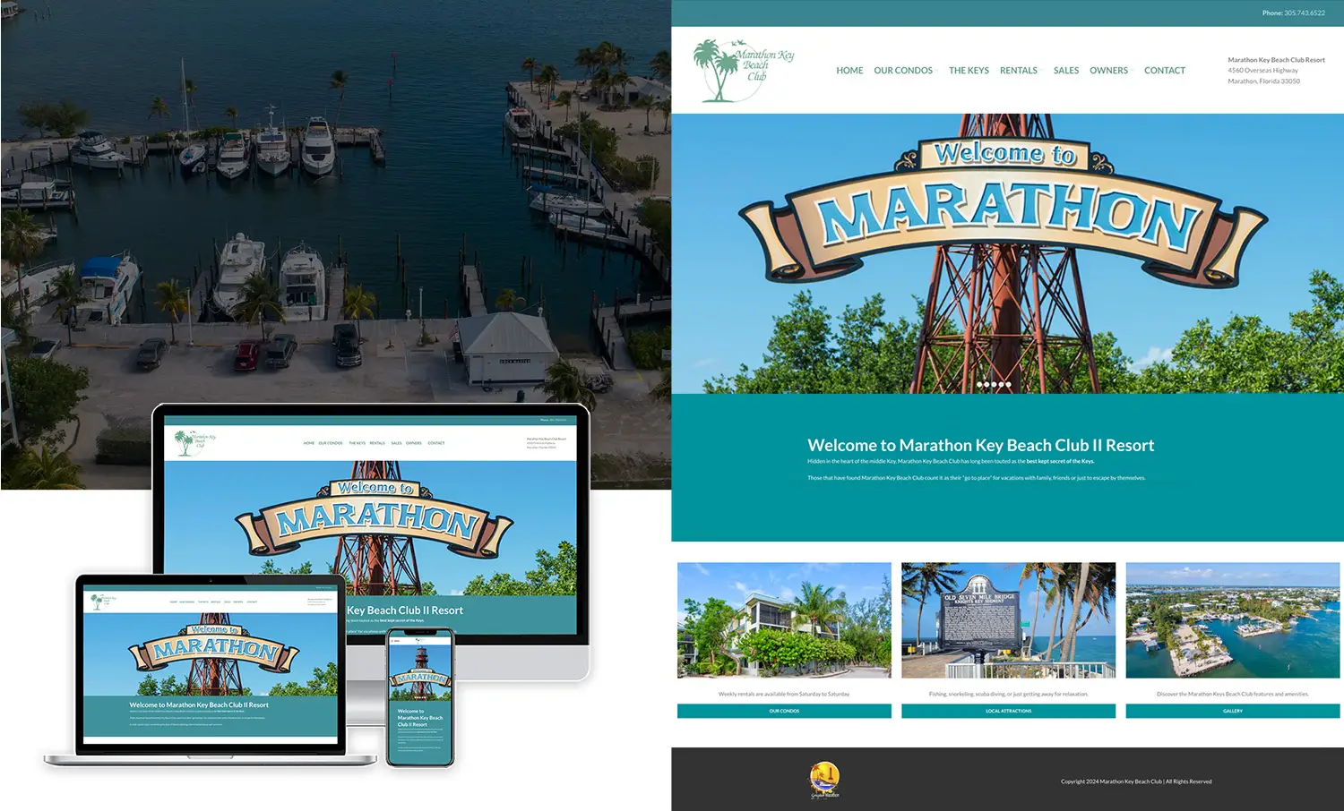
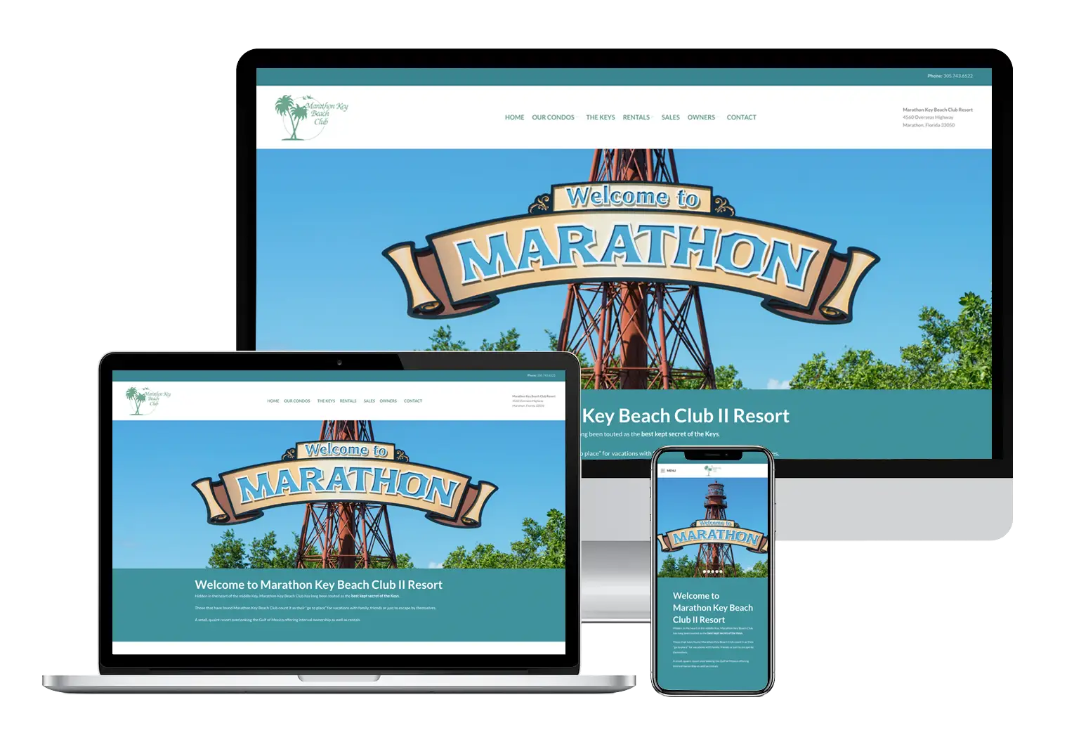
- Responsive mockup demonstrating how the Marathon Key Beach Club website adapts seamlessly across desktop, laptop, and mobile devices.
-
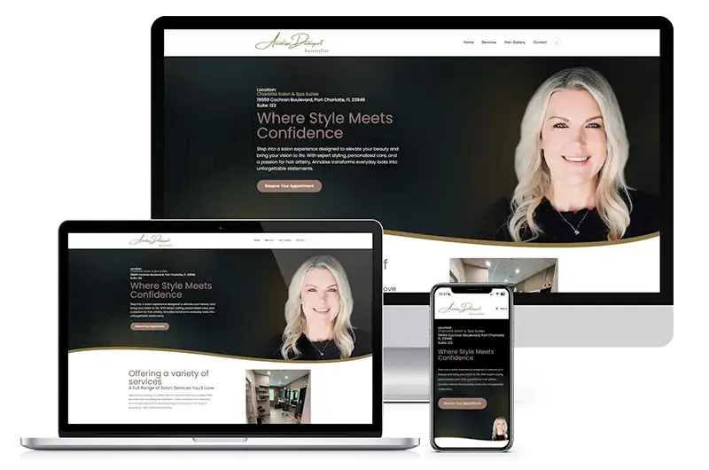
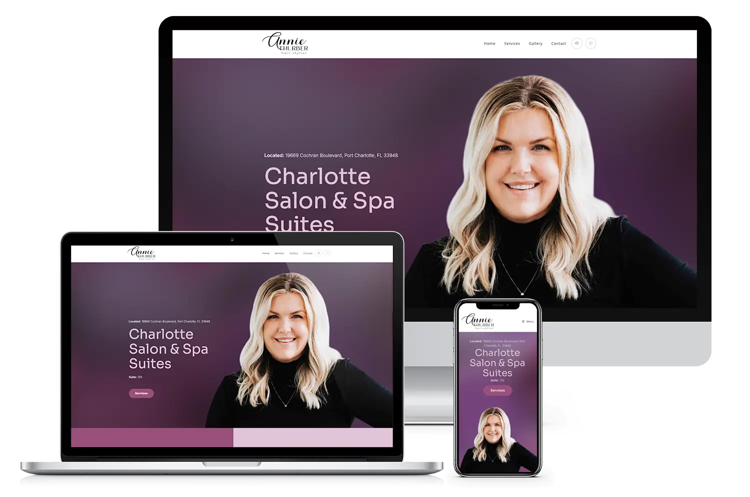
- Custom website design and rebrand for Annalise Davenport Hair Studio, elevating her presence and client experience in Port Charlotte.
-
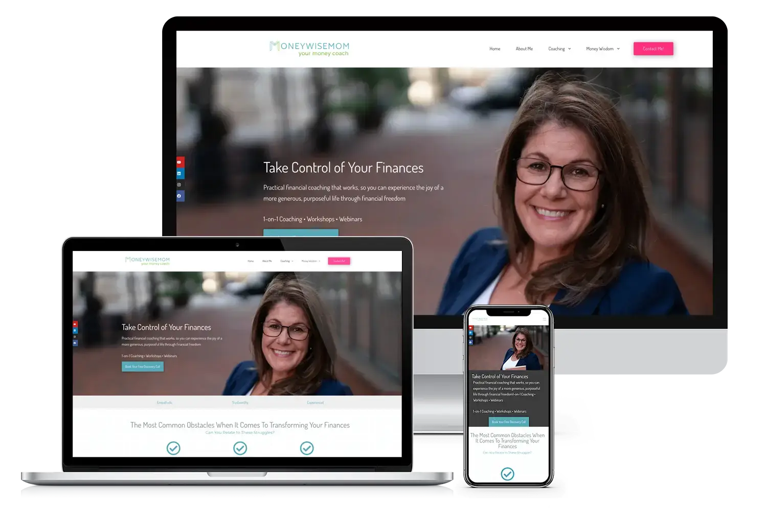
- Purpose-driven website design for Money Wise Mom, a financial coaching brand.
-
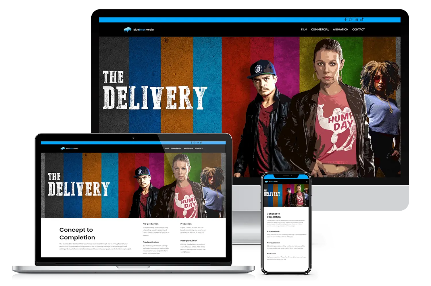
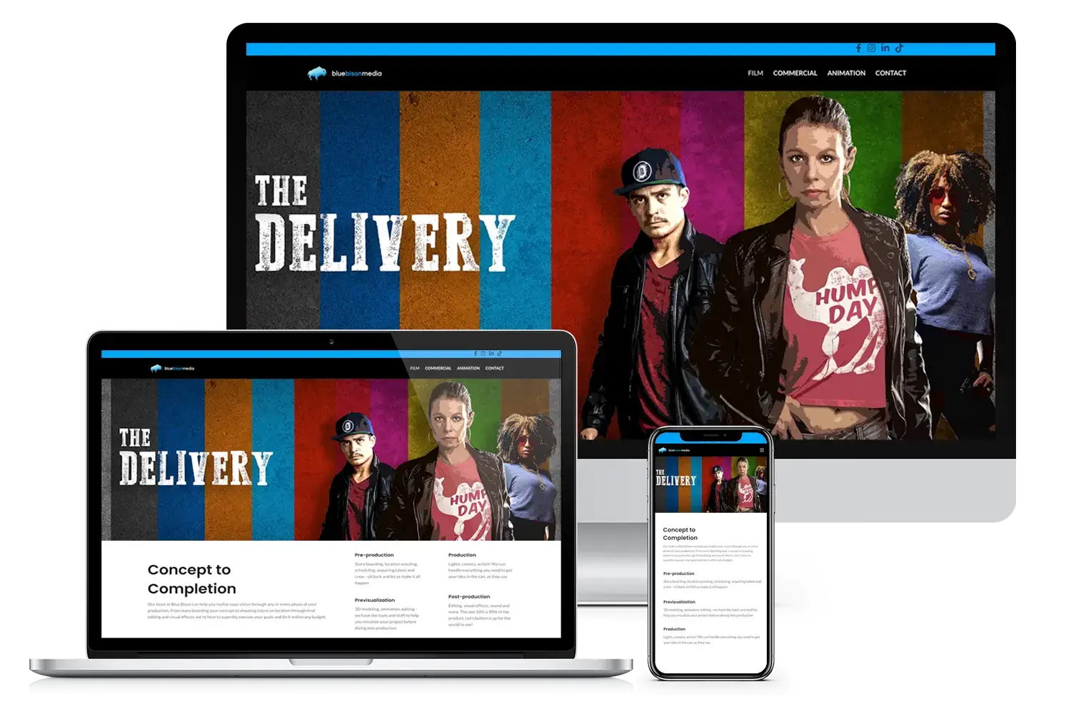
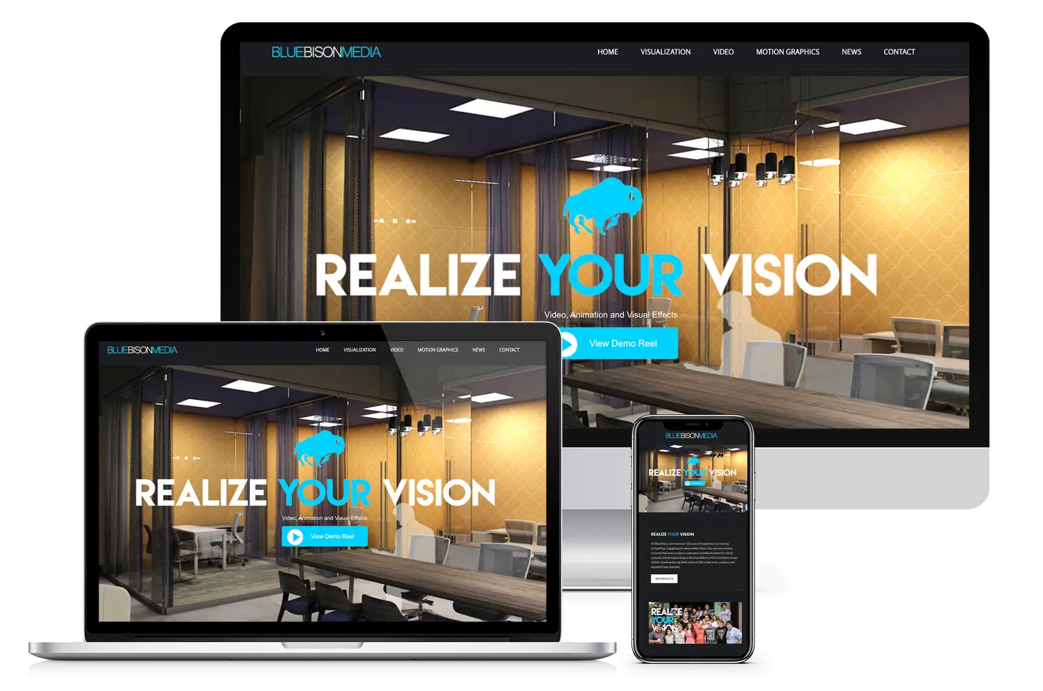
- Custom film website redesign for Blue Bison Media a Tampa bay Film production company.
-
- Purpose-driven digital marketing and web design for mission-led brands

-
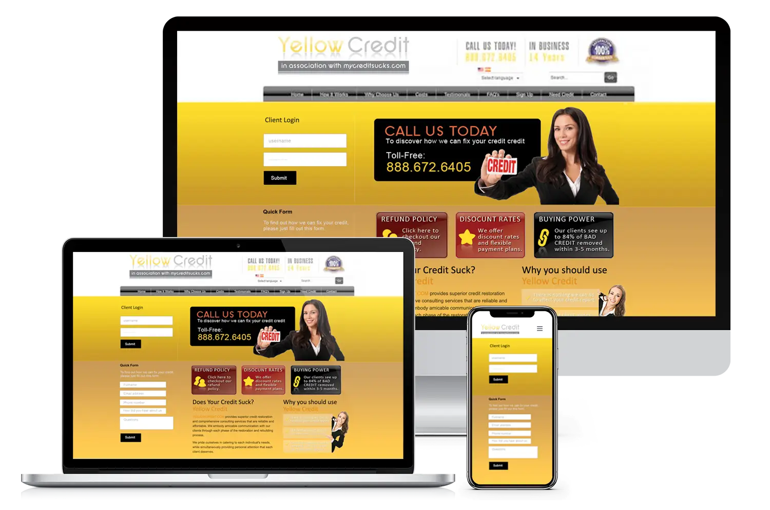
- Yellow Credit’s custom website includes strong calls-to-action and reflects positive feedback in client reviews for website design.

-
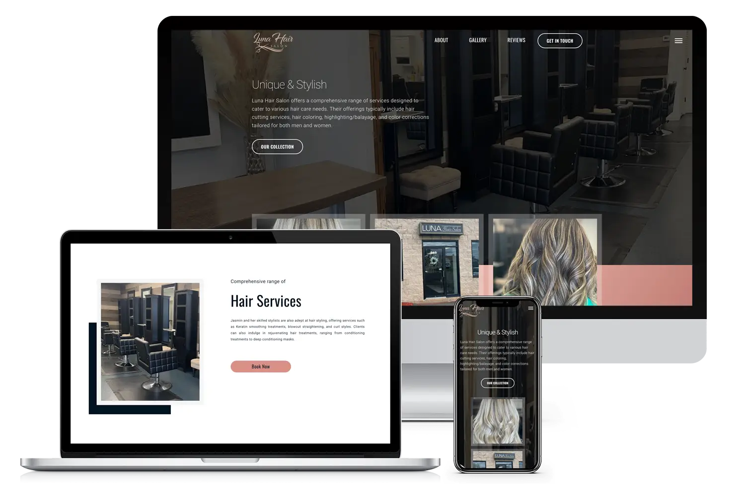
- Website revamp for Luna Hair Salon, designed for a female entrepreneur focused on beauty services
-
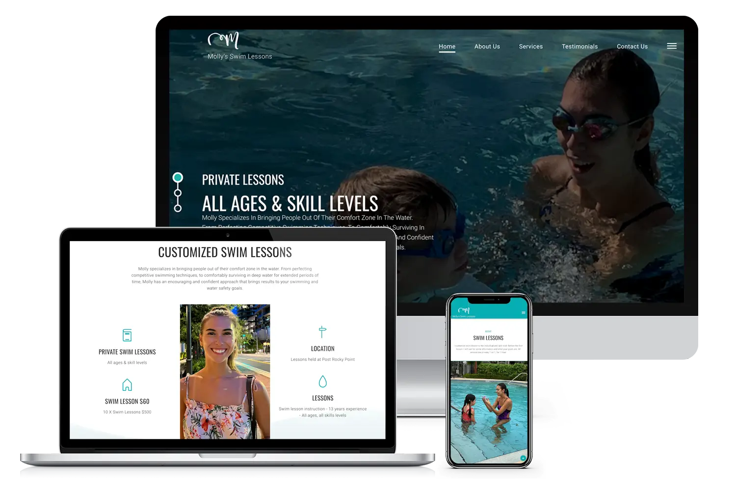
- Simple and effective website design for Molly’s Swim Lessons, built for a woman-owned service business
-
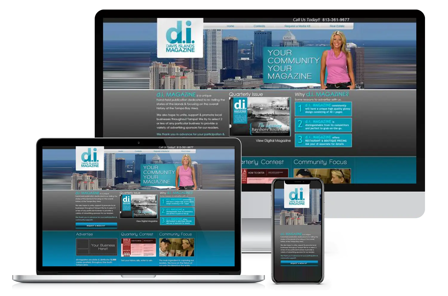
- Revamped website for Davis Islands Magazine, strengthening community reach and user experience
-
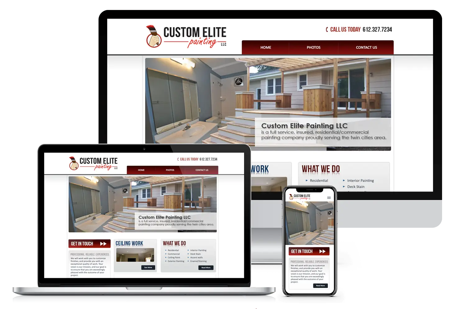
- Custom Elite Painting website redesign—an example of a satisfied client’s testimonial for custom website design services.
-
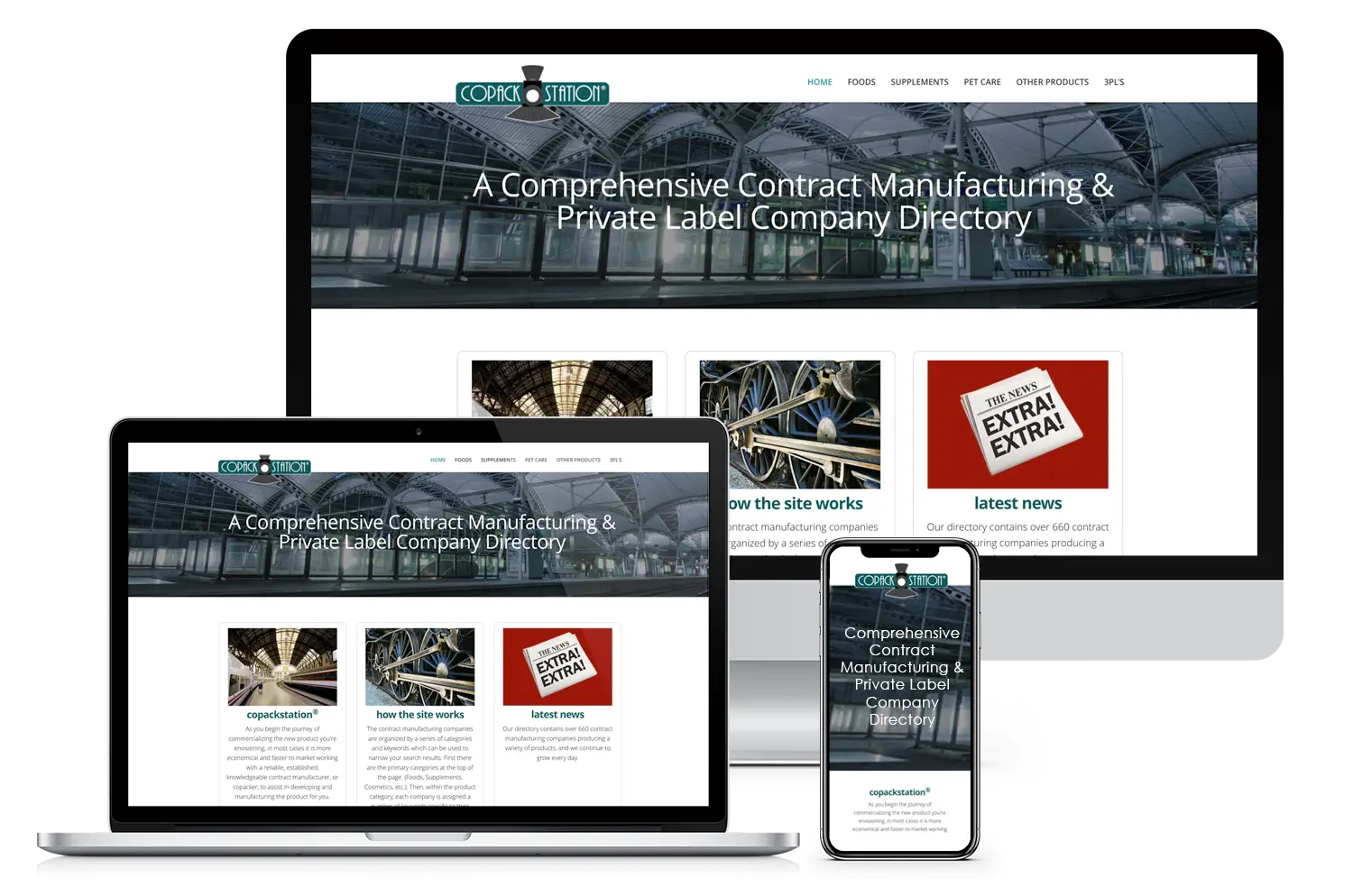
- Custom directory website for Copack Station, highlighted in client reviews for website design.
-
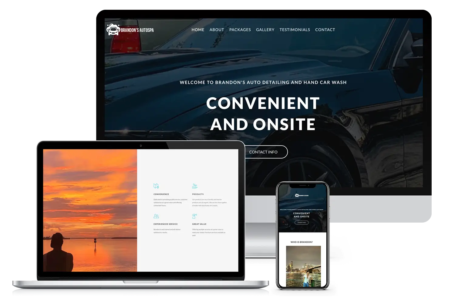
- A one-page Bootstrap site for Brandon’s AutoSpa, highlighted in client reviews for website design.
-
- The Delivery film project website by Blue Bison Media—highlighted in testimonials for custom website design services.
-
- Elegant website redesign for Annalise Davenport Hair Stylist, showcasing a positive client testimonial
-
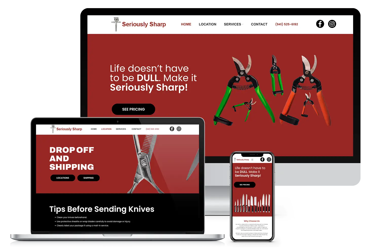
- Seriously Sharp’s new WordPress redesign brings sharper branding and smoother navigation, powered by purpose-driven digital marketing strategies that boost visibility and growth.
-
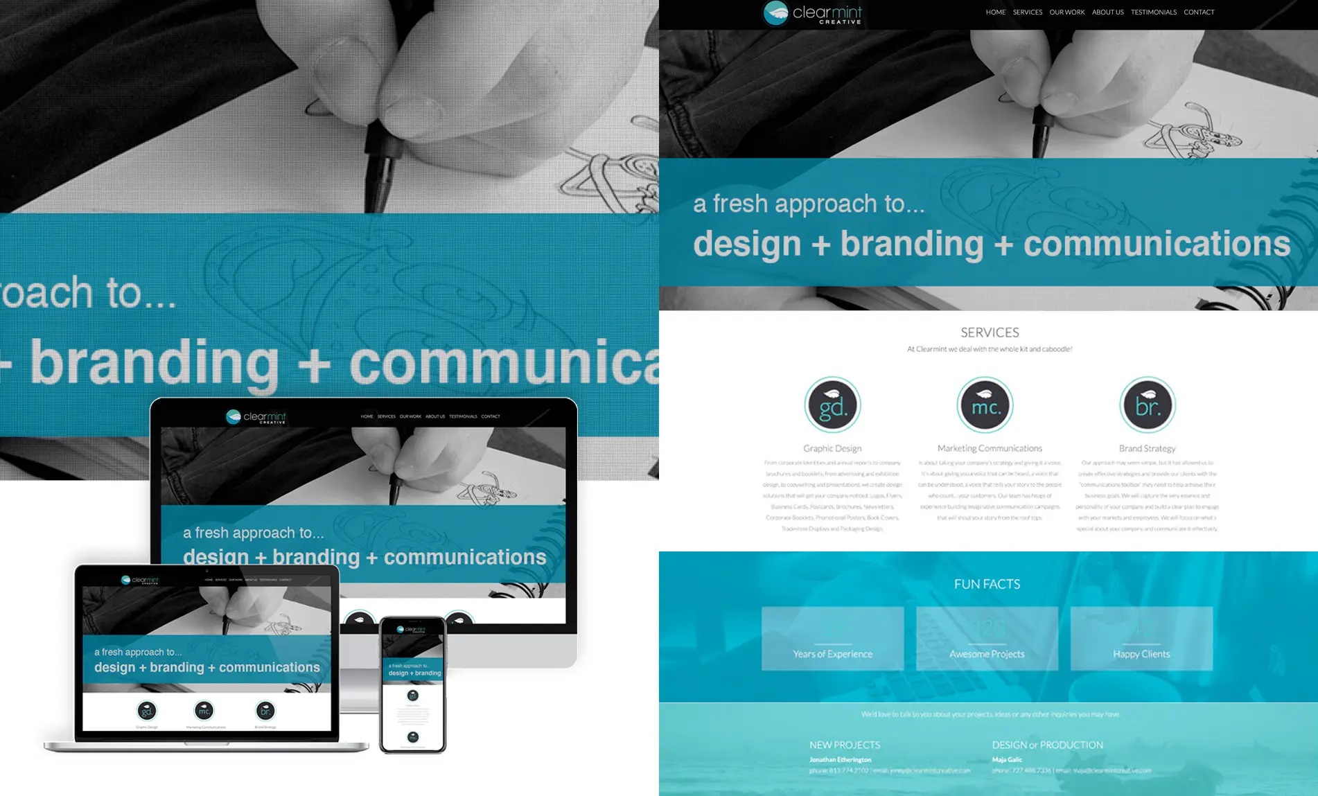
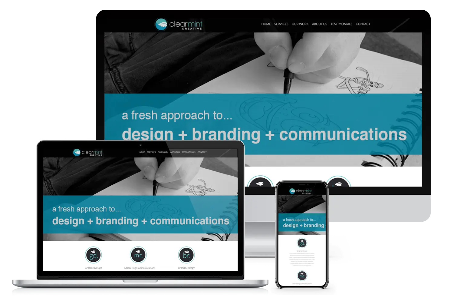
- Full branding and UI design for Clearmint Creative, a design and marketing agency
-
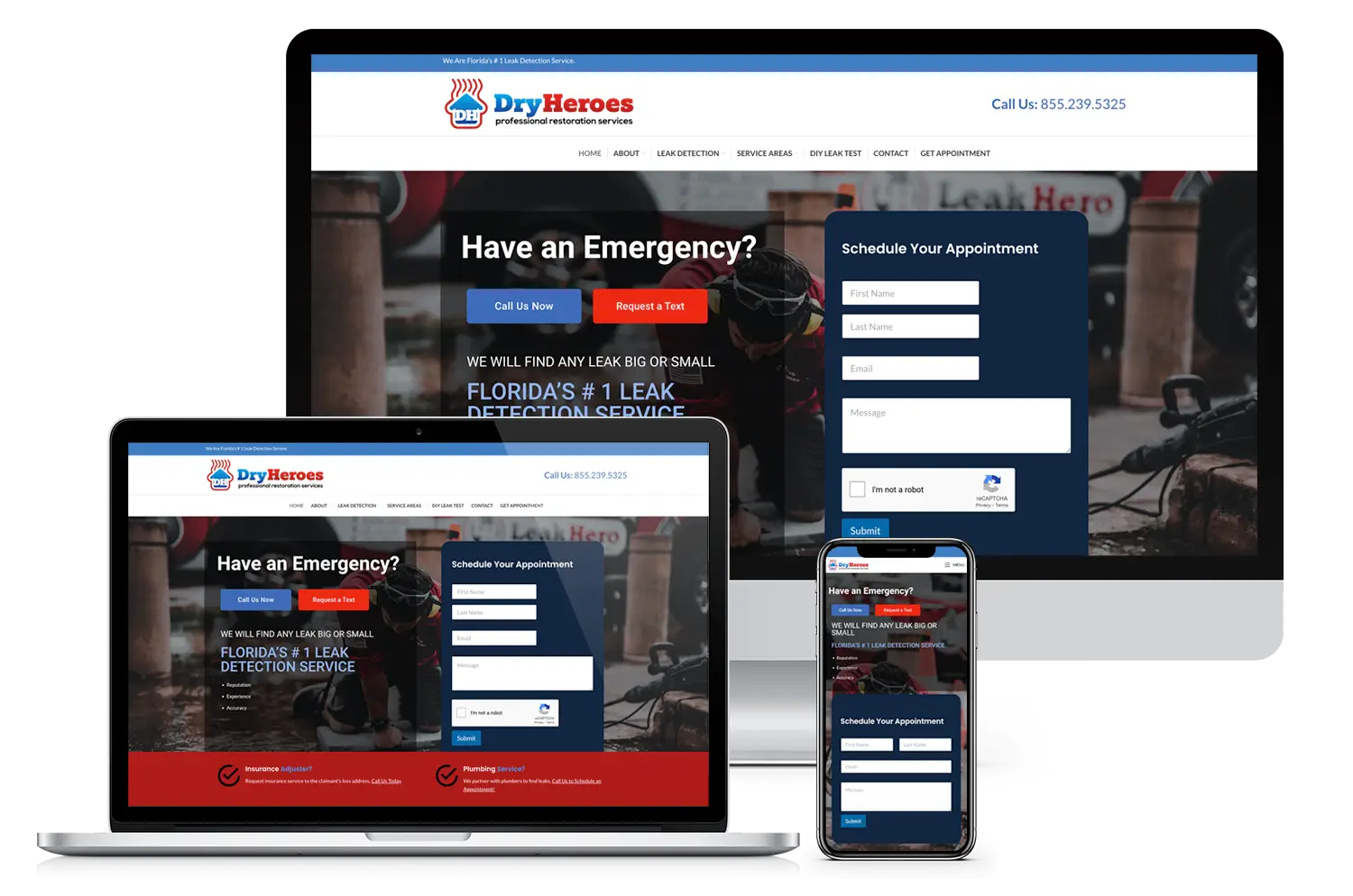
- Built to mirror their primary site, Dry Heroes’ website retains branding and layout integrity.
-
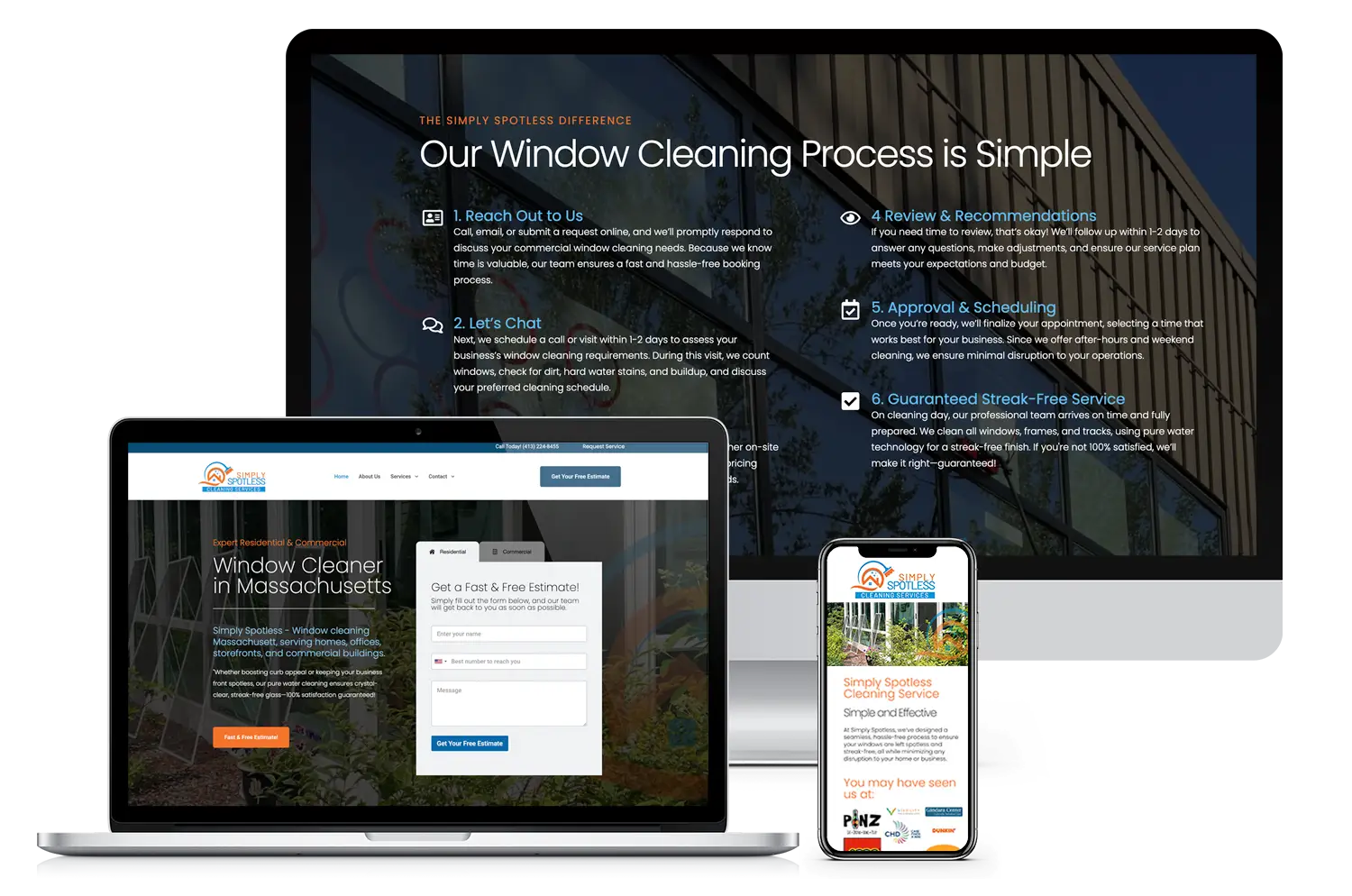
- Streamlined website redesign for a residential and commercial window cleaning company in Western Massachusetts
-
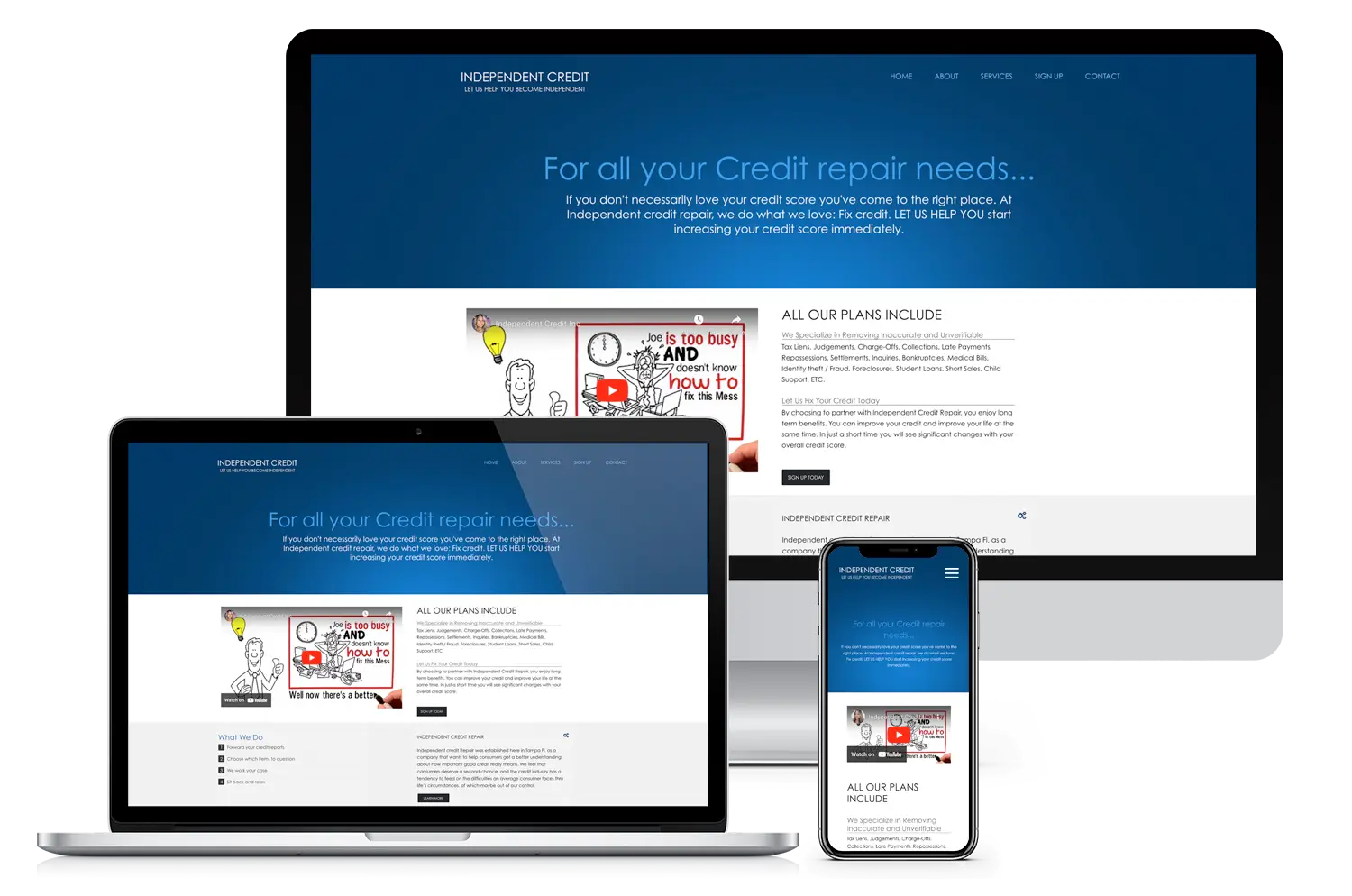
- Professional website development for credit repair services
-
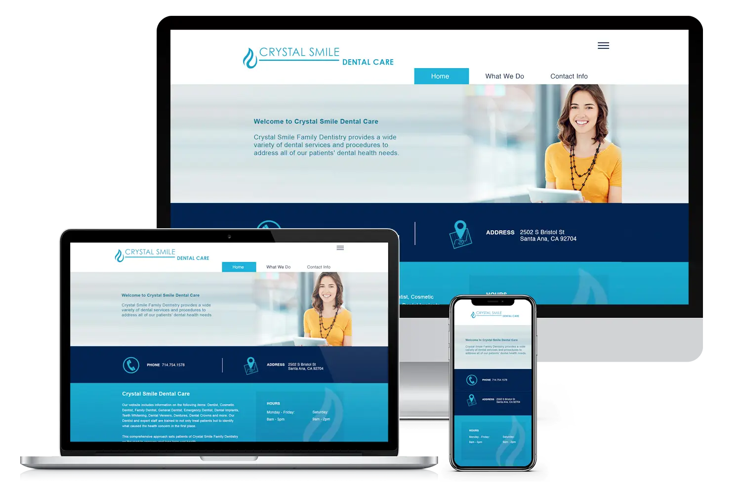
- Clean and approachable website design for a family dental practice
-
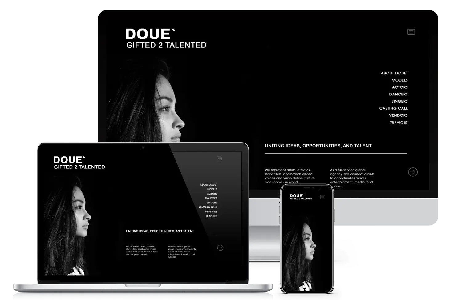
- Minimalist branding and website design for talent representation agency
-
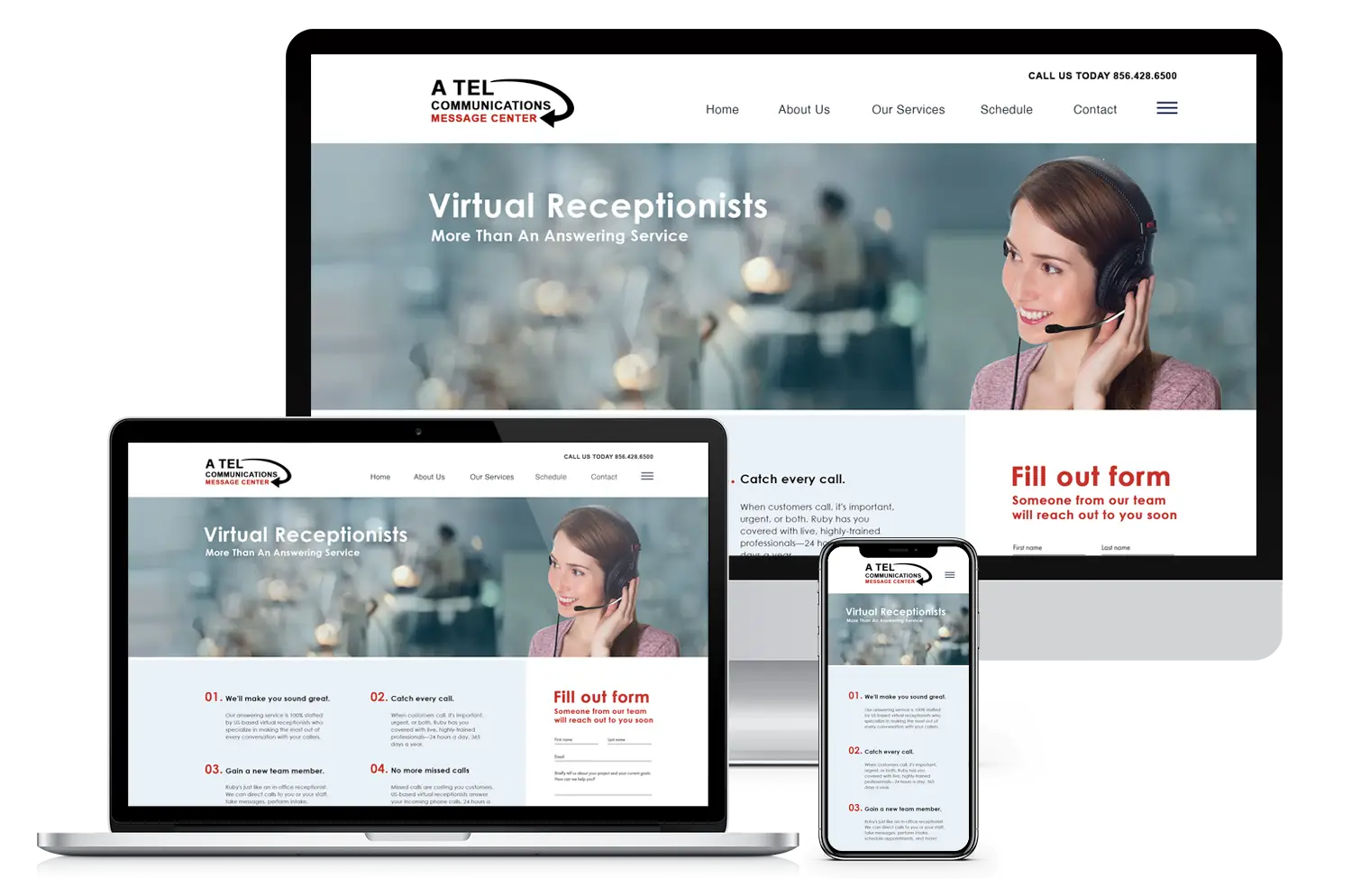
- Website redesign for virtual receptionist and communication services
-
- Stylish, minimalist website design for a modern hair salon

-
- A clean and cheerful website designed for Molly’s private swim instruction business.

-
- A sleek one-page layout built for Brandon’s mobile car detailing service in Western MA.

-
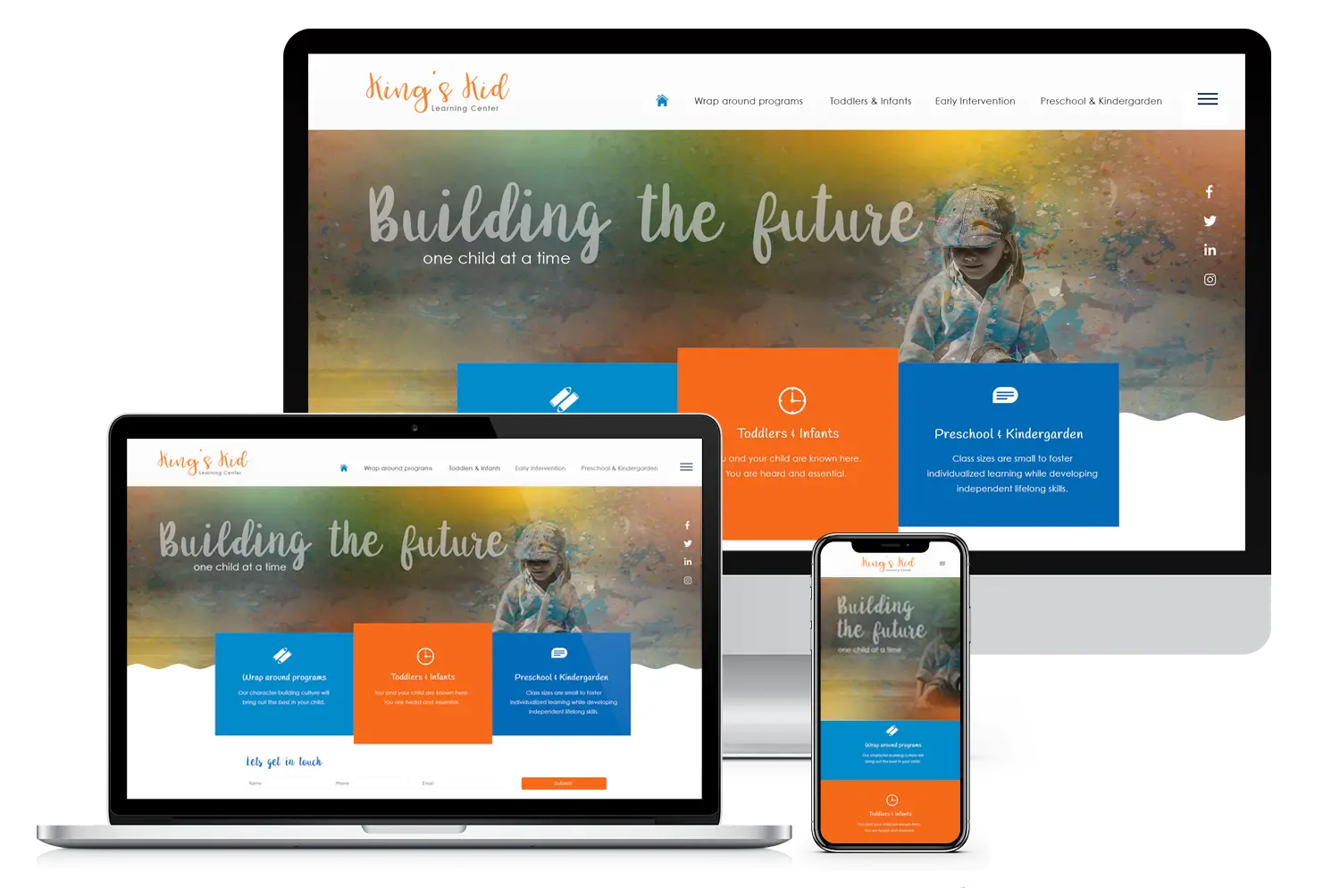
- Engaging UI/UX design for an early education center website
-
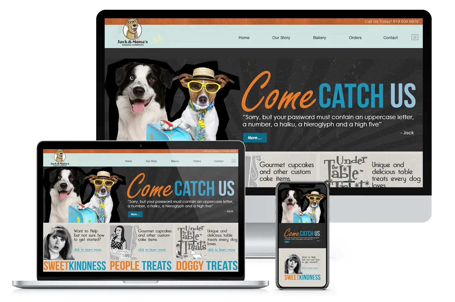
- Fun and vibrant website design for Jack & Mona’s Baking Company featuring branding and UX elements
-
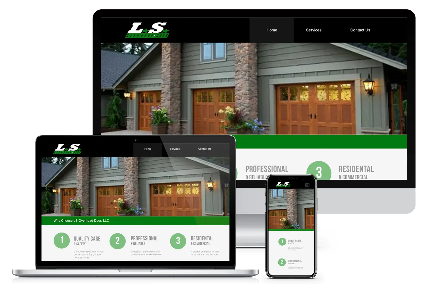
- Professional garage service website designed for LS Overhead Garage Doors
-
- Clean, responsive website design for Custom Elite Painting LLC.

-
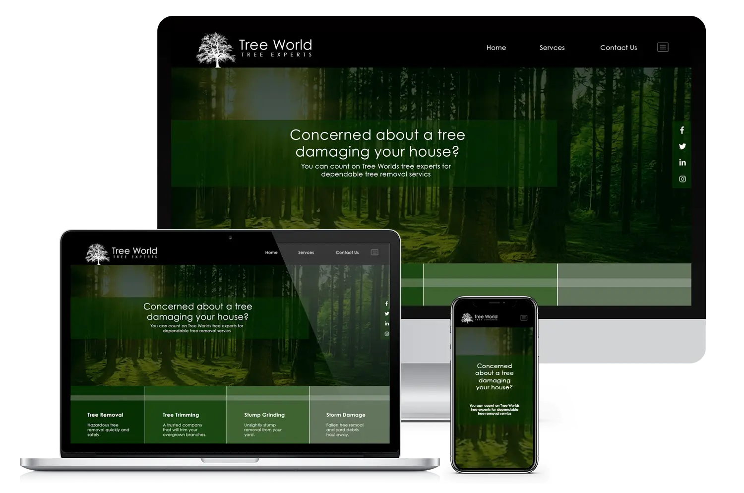
- Website development for Tree World Tree Experts’ service offerings.
-
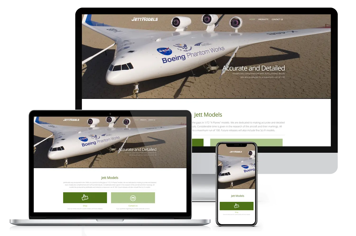
- Aviation-focused website design for Jett Models’ custom aircraft kits.
-
- Modern website development for CoPack Station’s contract manufacturing directory.

-
- Original Yellow Credit website before responsive revamp.
-
- Fresh branding and website revamp for Yellow Credit’s credit repair services.

-
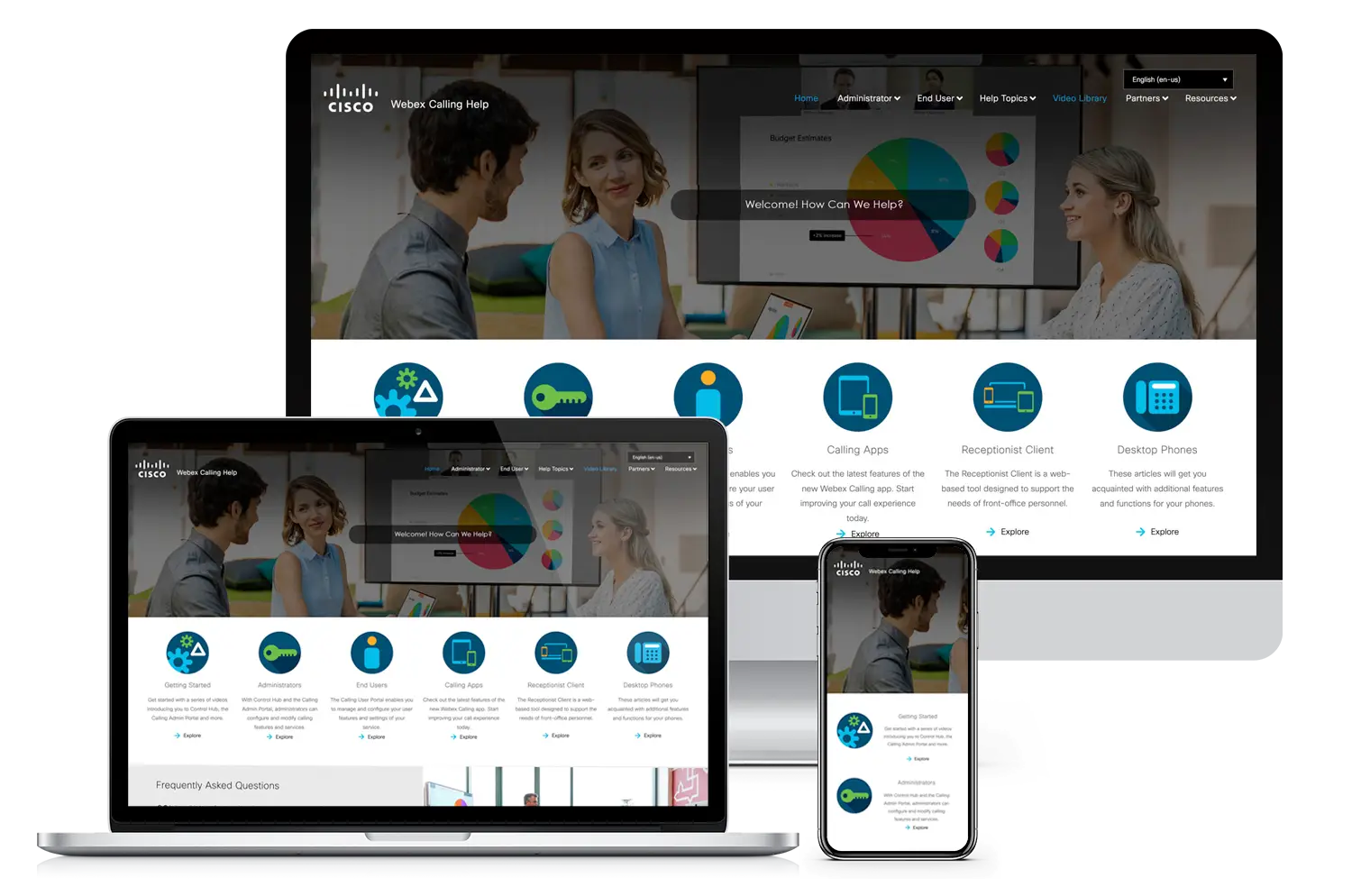
- Streamlined UI/UX design for Cisco Webex Calling Help portal.
-
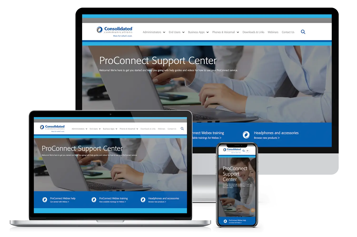
- Modern website development for Consolidated Communications’ ProConnect Support Center.
-
- Responsive web design showing the ContactUs.Co digital contact card platform across desktop, tablet, and mobile devices.
-
- Custom MMA and boxing training website designed for professional fighter Nick “The Hammer” Horton.
-
- WooCommerce ecommerce website designed for Dad Joke Jerky, a California beef jerky brand.
-
- Spanish church website design for Iglesia de Dios Huerto de Riego.
-
- Studio 26 Miami’s website redesigned with stronger visuals, better UX, and improved SEO to increase visibility for artists and bookings.
-
- Bold, modern logo design that defines your brand
-
- Corporate website designed for Oaktree Electronics, a global electronic components sourcing company.
-
- Shopify eCommerce redesign for Whip City Jerky’s online storefront.
-
- Responsive mockup demonstrating how the Marathon Key Beach Club website adapts seamlessly across desktop, laptop, and mobile devices.
-
- Custom website design and rebrand for Annalise Davenport Hair Studio, elevating her presence and client experience in Port Charlotte.
-
- Purpose-driven website design for Money Wise Mom, a financial coaching brand.
-
- Custom film website redesign for Blue Bison Media a Tampa bay Film production company.
-
- Purpose-driven digital marketing and web design for mission-led brands
-
- Yellow Credit’s custom website includes strong calls-to-action and reflects positive feedback in client reviews for website design.
-
- Website revamp for Luna Hair Salon, designed for a female entrepreneur focused on beauty services
-
- Simple and effective website design for Molly’s Swim Lessons, built for a woman-owned service business
-
- Revamped website for Davis Islands Magazine, strengthening community reach and user experience
-
- Custom Elite Painting website redesign—an example of a satisfied client’s testimonial for custom website design services.
-
- Custom directory website for Copack Station, highlighted in client reviews for website design.
-
- A one-page Bootstrap site for Brandon’s AutoSpa, highlighted in client reviews for website design.
-
- The Delivery film project website by Blue Bison Media—highlighted in testimonials for custom website design services.
-
- Elegant website redesign for Annalise Davenport Hair Stylist, showcasing a positive client testimonial
-
- Seriously Sharp’s new WordPress redesign brings sharper branding and smoother navigation, powered by purpose-driven digital marketing strategies that boost visibility and growth.
-
- Full branding and UI design for Clearmint Creative, a design and marketing agency
-
- Built to mirror their primary site, Dry Heroes’ website retains branding and layout integrity.
-
- Streamlined website redesign for a residential and commercial window cleaning company in Western Massachusetts
-
- Professional website development for credit repair services
-
- Clean and approachable website design for a family dental practice
-
- Minimalist branding and website design for talent representation agency
-
- Website redesign for virtual receptionist and communication services
-
- Stylish, minimalist website design for a modern hair salon
-
- A clean and cheerful website designed for Molly’s private swim instruction business.
-
- A sleek one-page layout built for Brandon’s mobile car detailing service in Western MA.
-
- Engaging UI/UX design for an early education center website
-
- Fun and vibrant website design for Jack & Mona’s Baking Company featuring branding and UX elements
-
- Professional garage service website designed for LS Overhead Garage Doors
-
- Clean, responsive website design for Custom Elite Painting LLC.
-
- Website development for Tree World Tree Experts’ service offerings.
-
- Aviation-focused website design for Jett Models’ custom aircraft kits.
-
- Modern website development for CoPack Station’s contract manufacturing directory.
-
- Original Yellow Credit website before responsive revamp.
-
- Fresh branding and website revamp for Yellow Credit’s credit repair services.
-
- Streamlined UI/UX design for Cisco Webex Calling Help portal.
-
- Modern website development for Consolidated Communications’ ProConnect Support Center.